
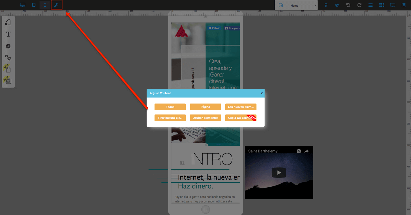
When making edits in Pixel Perfect to the mobile for the first time, you can use the “wrench” in the top left corner of the screen. That will take all of the content and move it over to the mobile workplace. It does not always move it perfectly, so you may have to make some adjustments.
The easiest way to edit for mobile is to litter (see picture below) all the elements, hide the ones you won’t use, and place the elements in the page in the order and look that you want. Remember to be careful with the header!
Common reasons for mobile issues:
#1 You might have moved one element from the body to the header or vice versa.
The elements on the header should be on the header in all versions as well as the elements on the body should be on the body in all versions, and the same applies to the footer. Sometimes when editing the mobile version you don’t realize you are dropping elements in the header.
#2 You might have changed the size of a timer. This will change it on all devices. In that case, you need to hide one timer and add another one.
You might have edited the text instead of customizing the text, that will change all your texts in all versions.
You might have changed the style of a button. This will change all buttons with the same style. In this case, you should hide one button and create a new one with a different style.
It is very important you watch the video tutorial on this page.
Important hint
Builderall gives you the high technology to show 3 different versions of the same website on different devices.
It is not responsive, it will not adapt by itself without control… with Builderall you have total control.
The system will identify the user’s device and show the respective version of your website… that way you can actually build a specific version with different content, images, buttons, call to actions, videos for each device.
Helpful Hints Part 1:
Helpful Hints Part 2: